
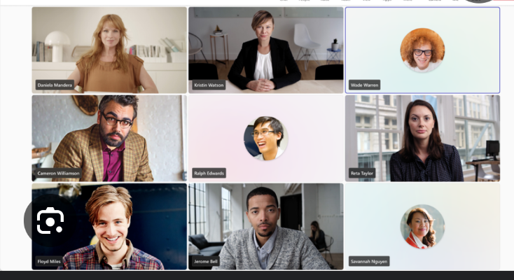
Now the squares that have no video and could have been easily put away elsewhere are now big as ever and colorful!
Fuck full screen of presentations! You need to see people’s names on big ass squares covering the entire screen! That’s where the money is! There is always a banana stand! (Don’t know the context)
Honestly, I prefer this Zoom-style view over the way teams segmented put camera-off people in that tray. Those people often got skipped over.
Zoom is so much better. Teams doesn’t even identify which screen pre-share. Oh you want to annotate or highlighter point? Install a plugin but only if you’re the organizer or allowed by the sharing party, and only if you’re using the native app.