Wow, your name is my name too.
- 0 Posts
- 16 Comments
Joined 1 year ago
Cake day: June 14th, 2023
You are not logged in. If you use a Fediverse account that is able to follow users, you can follow this user.

 8·5 months ago
Most closely matches the behavior of actual SNES consoles.
This requires very careful emulation of the timings of the various buses and co-processors, as well as on-cart chips which may or may not be present. For instance, a Speedy Gonzales game has a button in the final stage which crashes almost every emulator because enters an infinite loop reading from an open bus and waiting for the value to attain a specific pattern. However reading from an open bus is generally specified to be the last value loaded into the bus, which in this case is the load instruction itself, $18. So the value is read to be $1818 by most emulators, which doesn’t match the pattern expected.
However, this is only if you’re emulating with instruction level accuracy. It is possible for the value of the bus to change in between the instruction being loaded and the value of the bus being loaded due to an HDMA load being triggered, but this requires a cycle accurate emulator.
 1·5 months ago
Trigraphs are handled by the preprocessor, so if you’re not handling that, then that’s fine. Digraphs are handled by the tokenizer, however.
Are digraphs and trigraphs deprecated?
Did you reference the standard?
You make whomever is advertising via Google pay both Google and the website.
This doesn’t specifically use the template metaprogramming interface for C++, but seems to do what you want regardless. https://github.com/jmmartinez/easy-just-in-time
I’ve never used the library myself though.
 5·7 months ago
In my experience, it’s normally the other way around. I have no trouble opening doc and docx files made in libreoffice with MS office, but vice versa can sometimes be a little bit chancey.
Of course PowerPoint vs Impress just destroys the formatting both ways.
The last draft before publication: https://j3-fortran.org/doc/year/23/23-007r1.pdf
This is a cool idea. There are other programming languages that have libraries that expose similar behavior. For instance, Rust has the uom crate, Haskell has the units package, and C++ has the header only library SI.
But there is something to be said about it being built in.
If the streching is so small as to be unnoticable (and I agree it’s pretty subtle) then I also don’t really understand the benefit.
Typically, the idea behind this sort of design is that it should be unnoticeable. The motivation is that, with other monospace fonts, the differences in character width, along with the inconsistent spacing and line thicknesses are both noticable and distracting. Some of this badness is avoidable, and this is what this font attempts.
and yeah that height difference is really weird. That almost seems like a bug.
I’ve been informed, (and had to double check because I didn’t believe it,) that the two "i"s are actually the exact same height. The first looking larger than the second is an optical illusion. Font design is hard.
True, they are the exact same height. Holy optical illusion, Batman!
I suppose this is part of what makes font design so difficult.
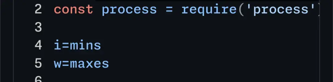
Here’s your code example in the editor. I don’t personally think the difference between the 'm’s is super noticable. But what did strike me a lot more is the difference in height between the two 'i’s in the first line. I think that difference is pretty bad.
A wrapping script is a small text file that calls the program you want to call. For instance in Linux this would be something like:
#!/bin/sh

deluge -torrent $1
You save it as deluge-wrapper.sh. Use chmod to enable the execution bit (
chmod a+x deluge-wrapper.sh). And then point your browser at it.Be sure to doublecheck that running deluge in this way does open the torrent. You can test it in the command line. It might be --torrent or I might be misreading or misremembering the code from last night. Additionally, it might be deluge-gtk or something.
When you attempt to open a link in your browser it calls the executable you specify with the link URL as its first argument. Glancing at the deluge torrent source, it seems to want a different command line than the one the web browser provides. You can fix this using a small wrapping script.
easily improve … C++
I assure you that there is absolutely nothing easy about the C++ standardization process, lol.
So like, it’s really easy to armchair and just say that they should ignore the haters and so on, but having been on the opposite end of a small Internet hate mob, even if you only have like a dozen people telling you that you’re a crook, or a piece of shit, or your stupid or dishonest, or whatever, it doesn’t really matter how accurate any of that is, it really does start to get to you, no matter who you are.
The only healthy option is to log out at that point.